






Design that respects Australian users and contexts
Our approach to UI and UX in Australia balances research depth with delivery speed. We start with clear objectives, map user journeys, and identify friction that slows adoption. From banking dashboards to health apps and logistics portals, each decision aims to improve comprehension, reduce cognitive load, and streamline priority actions. Interfaces benefit from consistent grids, expressive yet legible typography, and predictable interaction states that help people feel oriented.
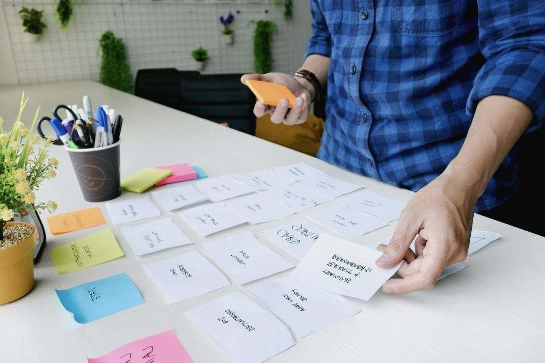
We collaborate closely with product leaders, engineers, and marketing teams to align on outcomes and constraints. Early sketches and wireframes clarify intent, while moderated usability sessions highlight what helps users move forward and where guidance is required. Insights shape component choices, error handling, empty states, and microcopy. Accessibility guides color contrast and focus order, while performance considerations keep pages responsive across networks common across Australia.
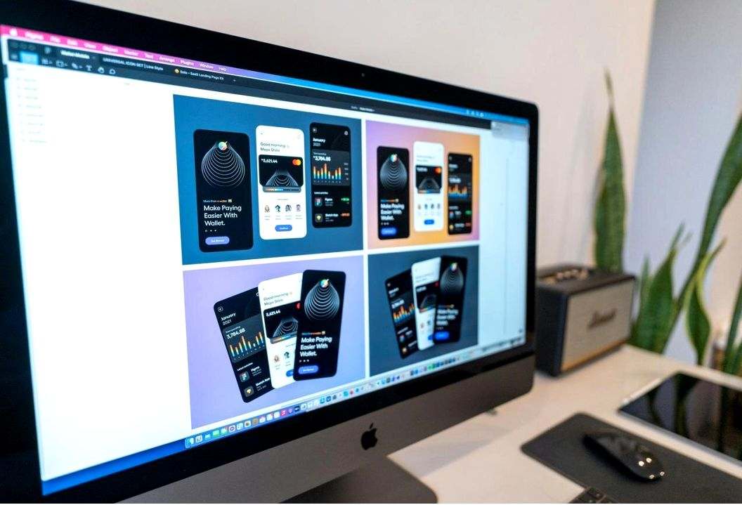
In Figma, we maintain layered component libraries, tokens, and usage notes. Teams receive annotated flows and handoff packs with spacing scales, states, and content examples. This reduces rework and keeps interfaces cohesive as features scale. We pair qualitative signals with metrics such as task completion, bounce patterns, and retention to inform steady iteration rather than risky overhauls.
When validating new ideas, lightweight prototypes encourage feedback without heavy engineering. We explore alternatives, compare decision costs, and document the reasoning that leads to chosen patterns. This narrative helps stakeholders champion changes and equips developers with specifics to implement interactions faithfully. Over time, systems evolve into a shared language that accelerates delivery.
Whether your focus is onboarding for regional audiences, complex data visualization, or mobile-first transactions, our team supports careful strategy and clear execution. Engagements are scoped transparently, with options for research sprints, UI polish, or end-to-end delivery. Pricing depends on scope and timeline; please reach out to discuss details and scheduling.